Nothing diminishes the impact of a headline like having its last word break and dangle helplessly.
Update 1/31/19: I updated my approach here after finding that it could be simpler and was previously capable of displaying two horizontally-aligned words without a space between them at just the right size.
You’re likely aware that this dangling specimen is typographically referred to as a widow or an orphan, best avoided since it’s a ding to readability.
In a print layout you might adjust the tracking between letters to either pull that widow back into the previous line or add a sense break so there’s a natural continuation point to a line with its own clause. But this is the interweb!
The Non-Breaking Space
One of my favorite ways to prevent widows in web layouts has been to add a non-breaking space between the last two words of a line so they’re forced to stay together if anything wraps.
The following headline, for example…
<h1>The quick fox jumps over the lazy dog</h1>…would become…
<h1>The quick fox jumps over the lazy dog</h1>This way, the words lazy and dog will be visually separated but functionally glued together. Dog won’t ever wrap onto a new line all by itself.
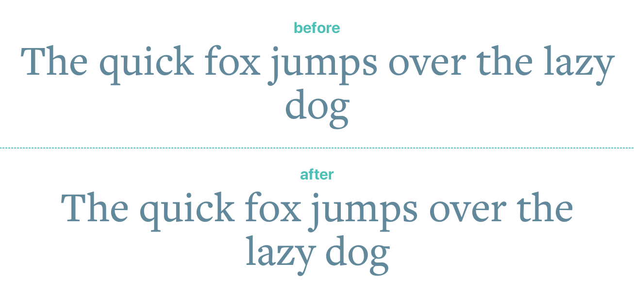
A non-breaking space keeps dog from being alone.
Various CMS plugins have made this easy, like the free and excellent Wordsmith Craft plugin that allows fine-tuning of widow prevention beyond the norm. You can also write a pretty simple regular expression to swap out the last space in any common programming or templating language.
The Problem With the Non-Breaking Space
One problem with this approach, however, is that a non-breaking chunk of text can actually push a narrower (mobile) layout out of its normal bounds if the joined words are long enough.
There’s plenty of room for the adjusted last line at a wider viewport, but out triumphantly-paired last words force a narrower viewport to scroll.
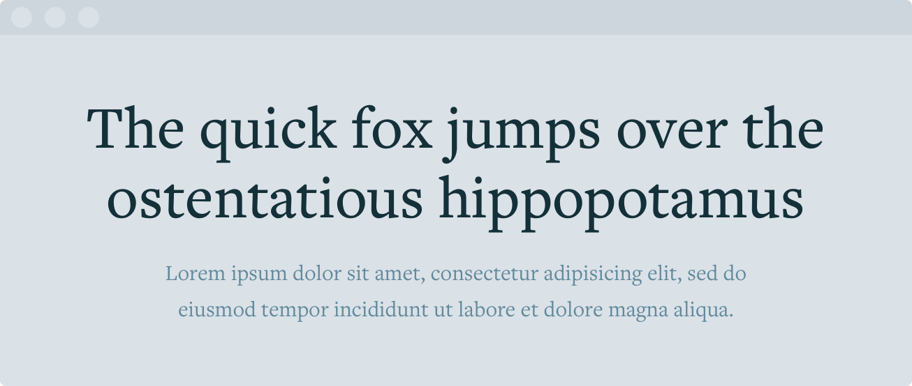
Looking great when there's enough width.
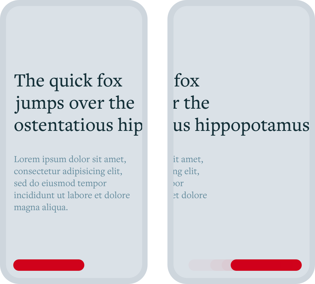
When the viewport is narrower than the joined words, it forces the layout to scroll.
Dan Mall shared two strategies for supporting responsive line breaks that got me thinking, but those are about breaking lines rather than preventing widows.
Breaking the Non-Breaking Space
I found a solution (I doubt I’m first to think of) that achieves each of my goals:
- Prevent widows.
- Avoid forcing narrower layouts to scroll.
- Avoid getting JavaScript involved in favor of a CSS-only approach.
- Maintain normal spacing if the stylesheet is completely removed.
The trick is to wrap the non-breaking space with a classed span, to which I can add a psuedo-element to allow breaking at a narrower viewport width replace the non-breaking space with a classed regular space and use the white-space property to control it at different breakpoints. In other words I…
- Keep relying on Wordsmith’s
widontTwig filter, which is a champ about adding that non-breaking space as I mentioned above. - Use a Twig macro to
wrapreplace the non-breaking space with a classed span wrapping a normal space I can style with CSS. Insert a hidden psuedo element that getsUsedisplay: inline-blockat a narrower breakpoint that would risk being held open.white-space: nowrapto prevent widows when there’s room, andwhite-space: normalto allow breaking when things get tight.
Starting point: widow-prone headline.
<h1>The quick fox jumps over the ostentatious hippopotamus</h1>Twig macro that adds a non-breaking space between the last two words, then wraps that non-breaking space in a span.widont.
{% macro responsive_widont(string) -%}
{{ string | widont | replace(' ', '<span class="widont"> </span>') | raw }}
{%- endmacro %}Resulting markup ready to be styled.
<h1>The quick fox jumps over the ostentatious<span class="widont"> </span>hippopotamus</h1>CSS class to maintain a non-breaking space but let it wrap when the viewport narrows.
/**
 * Control wrapping with CSS! :)
 */
.widont {
    white-space: nowrap;

    @media screen and (max-width: 576px) {
        white-space: normal;
    }
}
Once the viewport width is less than 576px, the span is forced shut so it doesn’t occupy any horizontal or vertical space—but it’s not hidden because the empty pseudo element pops into place and once again allows the text to wrap.
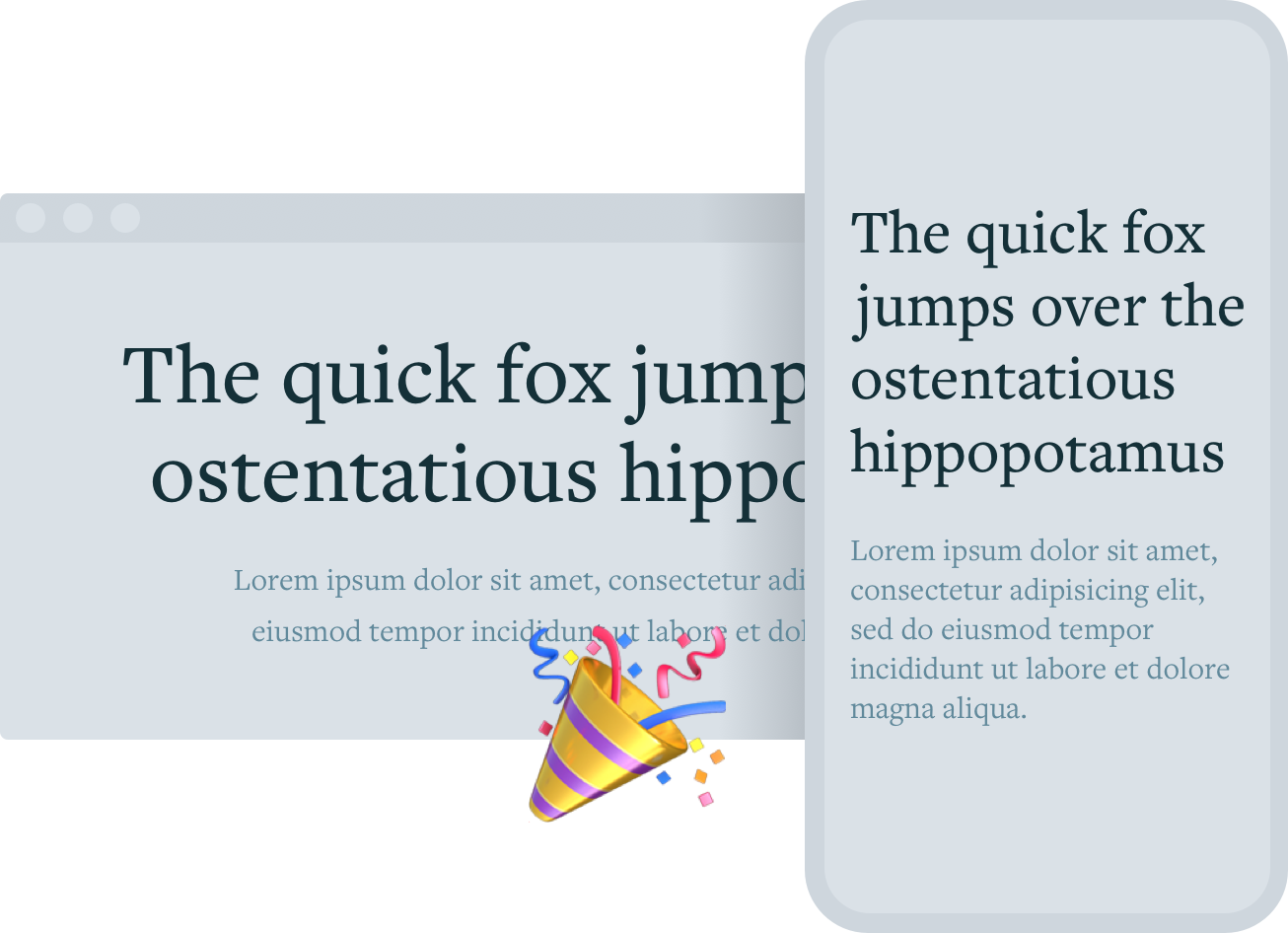
Widow prevented when there's room, layout maintained when there's not.
This isn’t perfect because it only addresses simple containers that are normally wide and end up hugging the viewport as they scale down; there could be trickier situations like columns or changing card sizes that this wouldn’t address.
That said, it seems to work well and I’d love to know if you’ve handled this differently or have any ideas to make it better!