
I got Storybook working again for my Gatsby JSX components and found a nice, simple way of switching between dark and normal styles.
Background
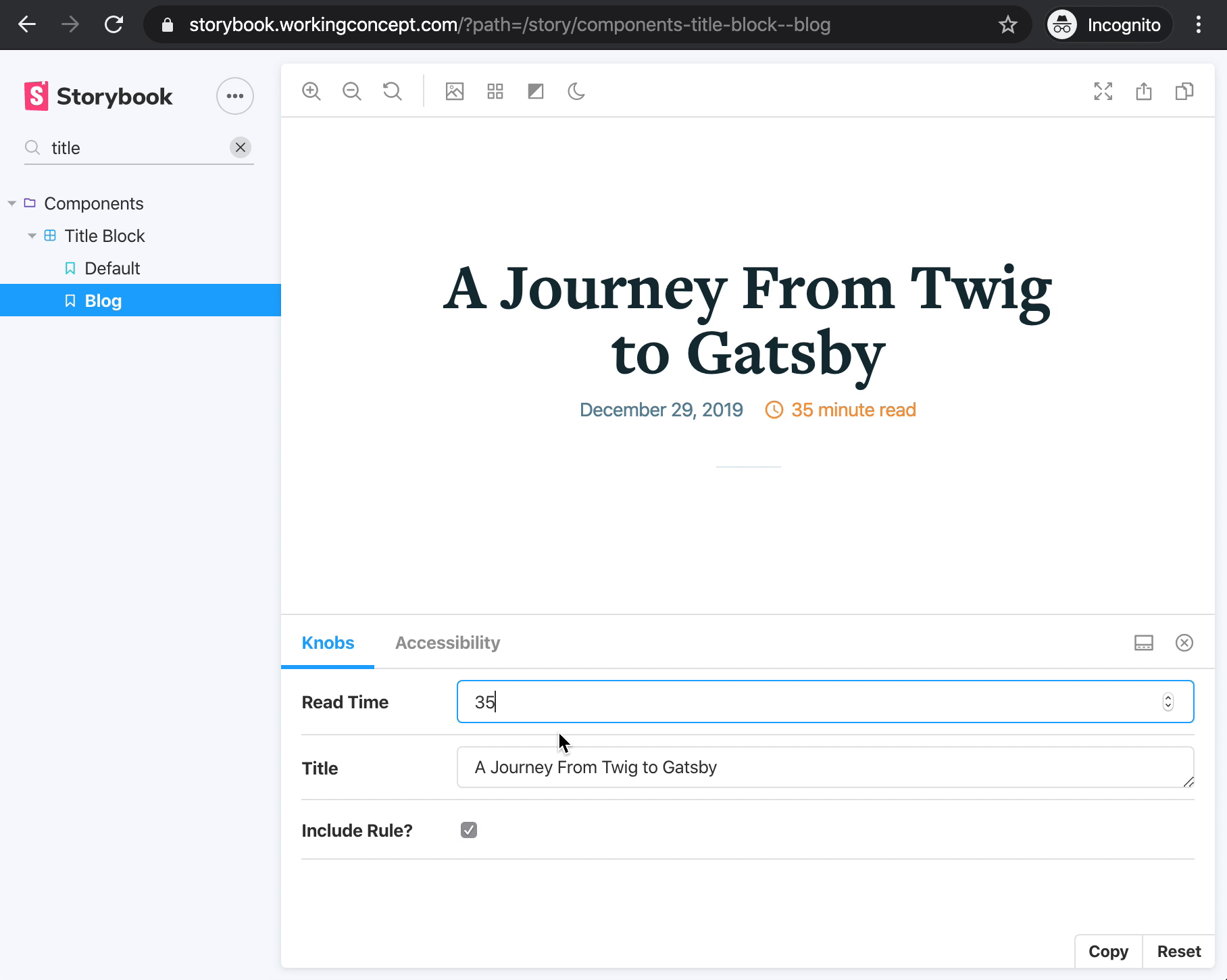
Storybook is a lovely tool for developing and cataloging UI components. You can add it to your codebase, write brief “stories” for components to document and mock data to feed them, and spin up a nice browser UI. You can also generate static output to host wherever you’d like.
I’ve added Storybook to projects that use Twig, Vue, or React. Two reasons:
- It’s a nice way to work.
I can use Storybook like a workbench and focus on one component at a time without concern for the CMS. Hot module reloading (HMR) keeps things fast and fluid. Storybook’s tools make it quick to mess with inputs, modify the viewport, and run accessibility checks. (Among other things.) - It’s a useful way to review work in progress.
Storybook URLs can jump straight to specific components and variations, facilitating discussion about new UI outside the context of the production site. Stories accumulate into an always-current reference, which is particularly useful planning with designers and content authors.
The dark mode bandwagon is a bumpier ride.
If you’ve added dark mode CSS to a project, you might have found it clunky checking your work toggling system or browser settings. Like checking print stylesheets, it’s inefficient enough to add drudgery and pull you out of The Zone.
There’s already an addon for switching the Storybook interface to and from dark mode, but I want to simulate dark mode for the components themselves.
Storybook has an event system you can subscribe and react to, and this dark mode addon fires an event when the UI mode changes. All that’s left is to let the component preview pane know what mode to display.
I had to make two changes to my project: one to my strategy for applying dark mode styles, and another to the Storybook setup.
First, I switched away from using a media query to apply dark classes with @media (prefers-color-scheme: dark). Instead, I decided I’d detect that setting with JavaScript and apply a body class. This makes JavaScript a requirement, but it means I can honor the visitor’s browser setting by default and expose the dark scheme as an option on the site.
Now that I could toggle dark mode with JavaScript, the next step was ... to toggle dark mode with JavaScript. In Storybook, this meant listening for a change to the dark mode UI preference and responding accordingly. This was a matter of adding a few lines to .storybook/config.js, simple enough I nailed it on my very first try. 🎉
Toggling dark mode on and off for the UI and component pane.
The change for the site was nearly the same. Let’s take a look.
The Steps
1. Set up Storybook.
Add Storybook to your project and write a story for your favorite component.
2. Install the dark mode addon.
github.com/hipstersmoothie/storybook-dark-mode
3. Write dark mode styles.
You’ll need styles meant for dark mode, applied when the document’s body class is .dark. I have some PostCSS that looks like this:
body.dark {
  @apply bg-oxford-blue;
  @apply text-light-gray;

  .text-slate {
    @apply text-light-gray;
  }

  pre,
  code,
  code[class*='language-'],
  pre[class*='language-'] {
    @apply bg-black;
  }

  /* There's more, but nothing that’d surprise you. */
}
Global dark mode styles with Tailwind utility classes.
Tailwind isn’t important here, but side note if you use Tailwind: there’s a plugin for adding dark mode utility classes. I haven’t tried it yet, but its strategy is similar requiring a mode-dark class applied to the html element.
4. Respond to Storybook UI mode changes.
Add the following import and snippet to .storybook/config.js:
import addons from '@storybook/addons'

// get an instance to the communication channel for the manager and preview
const channel = addons.getChannel()

// switch body class for story along with interface theme
channel.on('DARK_MODE', isDark => {
  if (isDark) {
    document.body.classList.add('dark')
  } else {
    document.body.classList.remove('dark')
  }
})
This will toggle a dark class on the body of the component preview pane when the Storybook UI theme changes.
5. Add the dark mode class with your site/app.
Make sure your project handles the body class, too!
This step is optional for the purpose of this post, but if you forget you may wonder why your dark mode styles never work outside Storybook.
I chose to do this in my layout component, passing the desired body class to Helmet:
const Layout = ({ children }) => {
  // make sure `window` exists, then check whether the visitor prefers dark mode
  const prefersDark =
    typeof window !== 'undefined'
      ? window.matchMedia &&
        window.matchMedia('(prefers-color-scheme: dark)').matches
      : false

  // give Helmet a body class to apply
  return (
    <>
      <Helmet
        bodyAttributes={{
          class: prefersDark ? 'dark' : 'normal',
        }}
      />
      <Header />
      {children}
      <Footer />
    </>
  )
}
The check for window is important in this context because it won’t exist during server side rendering (SSR).
There’s a similar example, classing the html element, in the tailwindcss-dark-mode project: prefers-dark.js.
This strategy relies on the style cascade, so I’m not sure how useful it will be in a CSS-in-JS world but I’ll deal with that when I get there.
I’m hoping somebody’s as thrilled as I am to toggle back and forth easily!